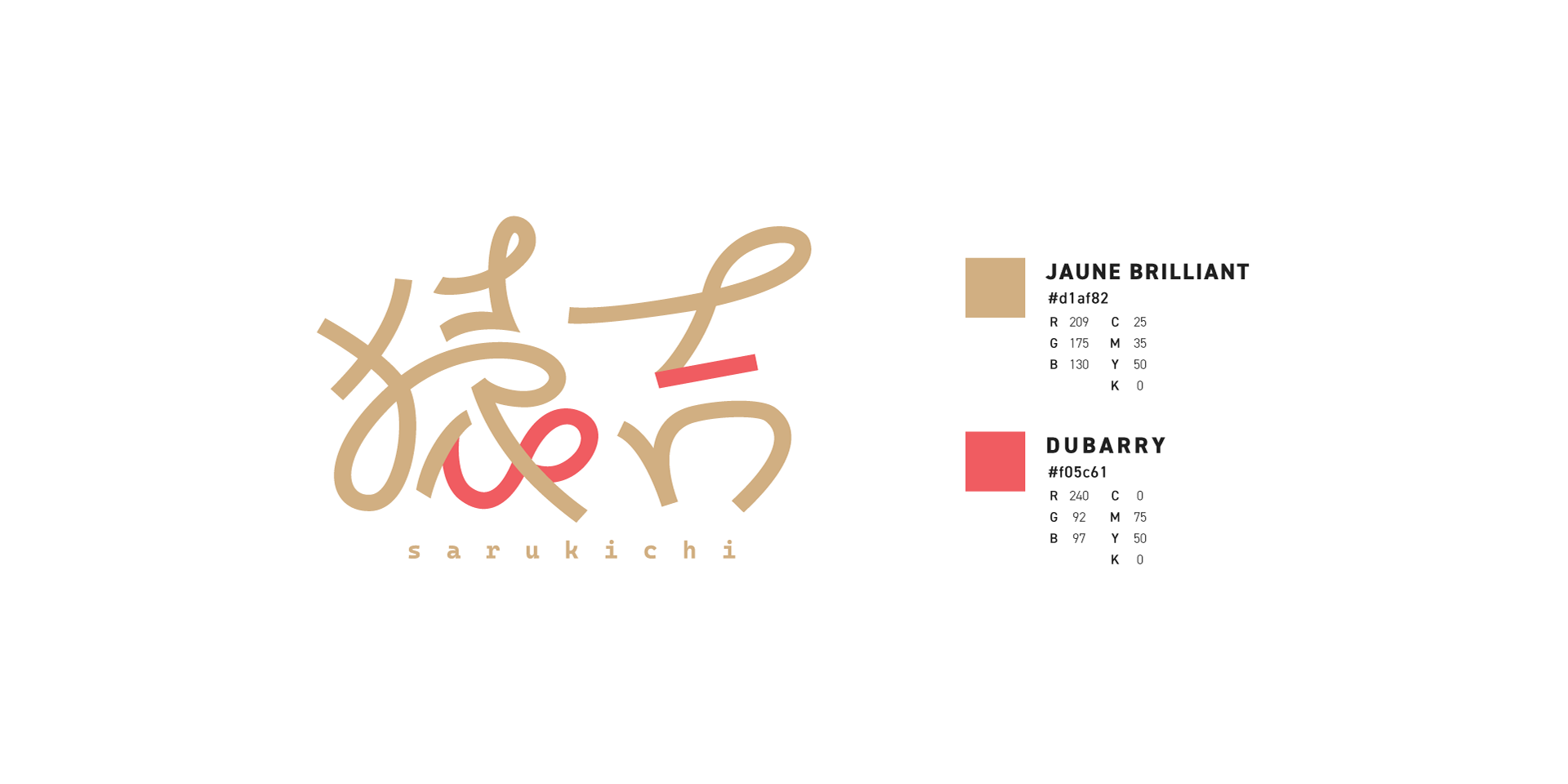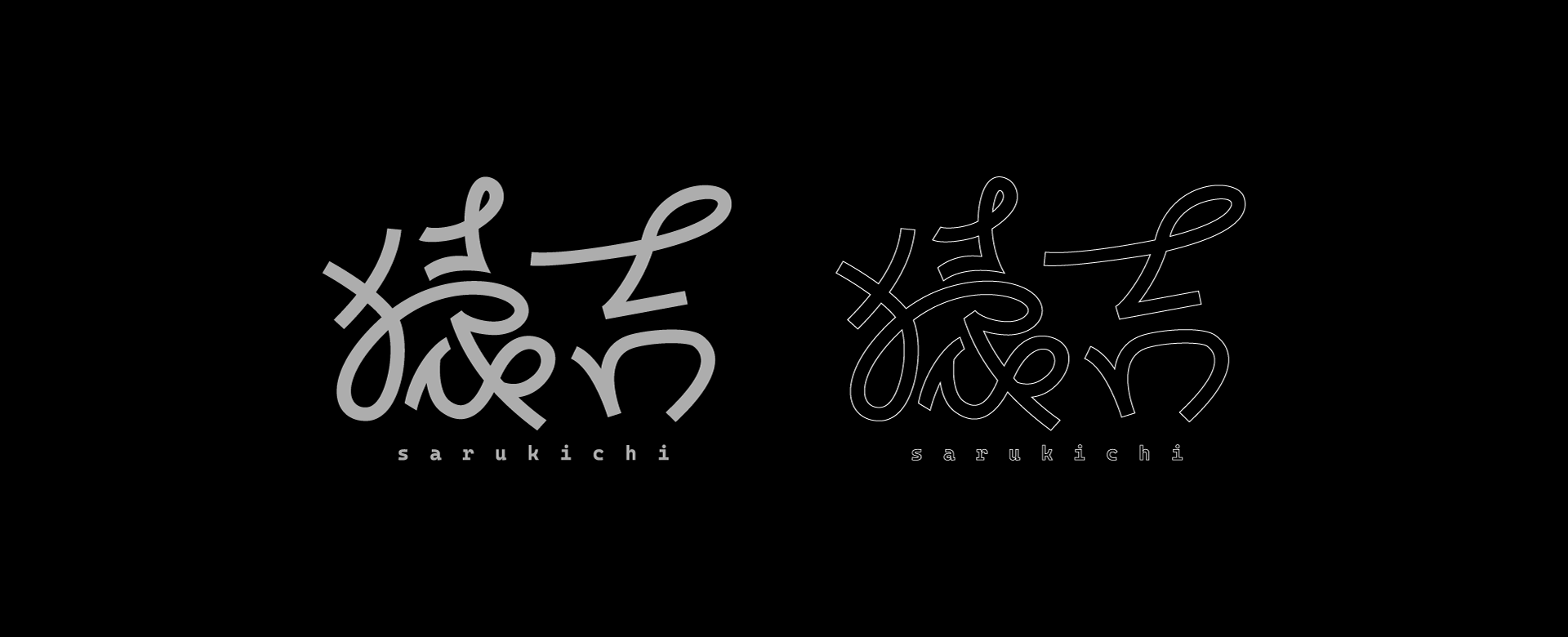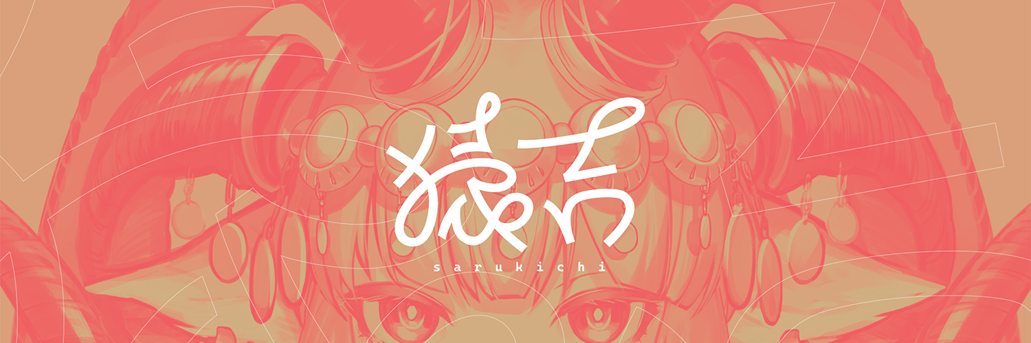
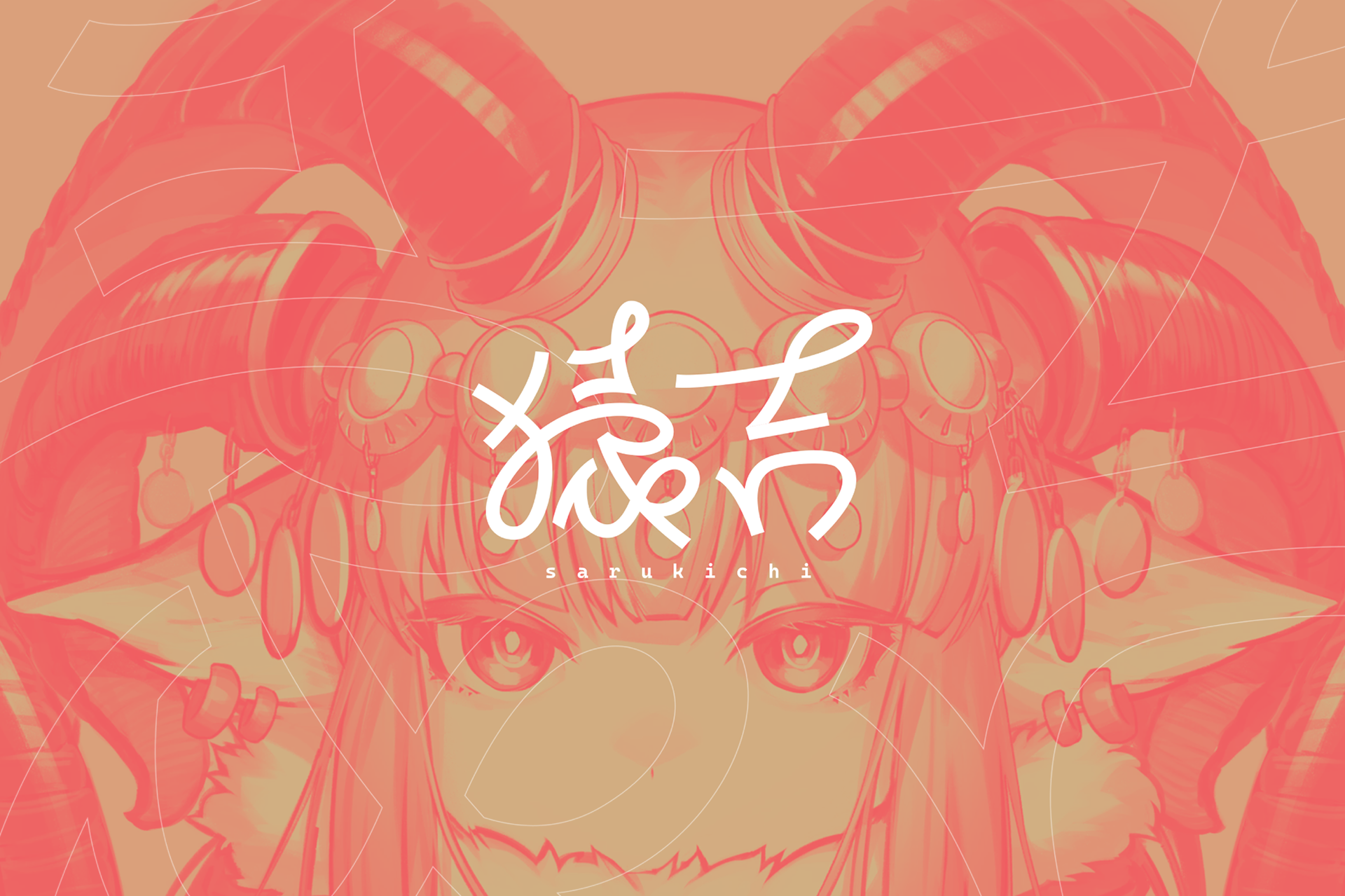
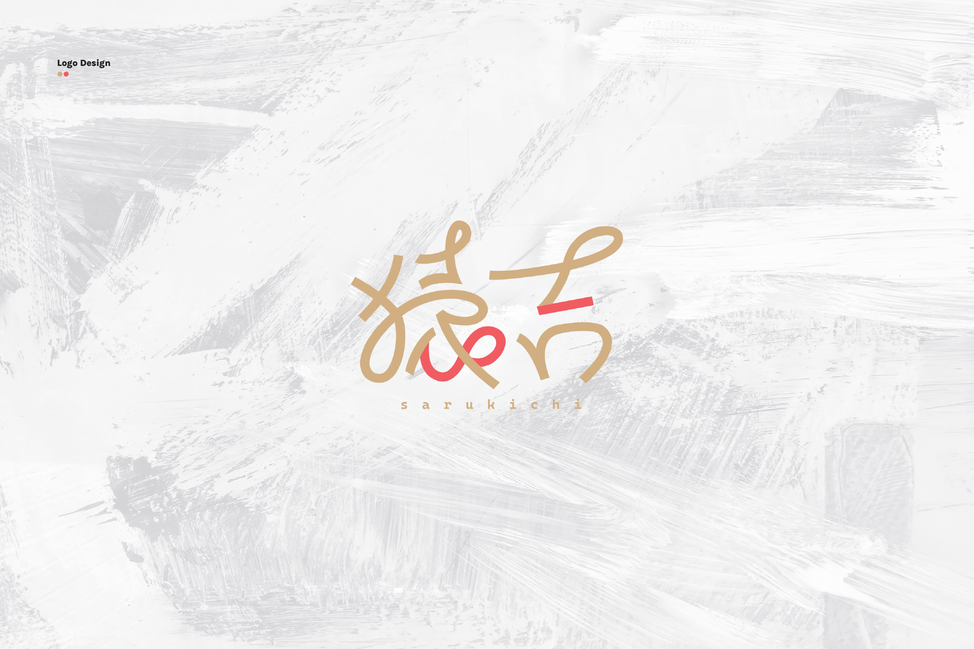
In designing the logo for the illustrator "Sarukichi," I analyzed the style of her illustrations and arrived at an image that is both curvaceous and cute, as well as clean and modern. Although the two characters for "Sarukichi" have different stroke counts, I achieved a balanced typography by omitting them while maintaining readability.